Stop Hiding Behind Black: How to Use Color to Celebrate Your Curves (Not Cover Them)

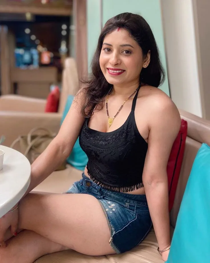
Photo: confident curvy plus size woman in bright colorful outfit fashion editorial, via tfiglobalnews.com
Somewhere along the way, curvy women got handed a very specific rulebook. Wear black. Avoid prints. Dark on the bottom, darker on the top. Don't draw attention.
And honestly? That rulebook can go straight in the trash.
The "dark colors minimize" approach isn't just outdated — it's rooted in the idea that curves are a problem to be solved rather than a shape to be dressed. And that framing is something we fundamentally reject here at Stylish Curves. Your body isn't a silhouette to be managed. It's something to dress with intention, creativity, and joy.
Color is one of the most powerful tools in your wardrobe — and most curvy women have been taught to fear it. Let's change that.
Why the 'Dark = Slimming' Rule Was Always Oversimplified
Let's give the old rule its due for a second: dark colors do create less contrast against most backgrounds, and contrast does affect perceived dimension. There's a grain of truth there. But the leap from "dark colors create less contrast" to "curvy women should only wear dark colors" is a massive, reductive overstep.
Color psychology research tells a much more nuanced story. The human eye is drawn to contrast and brightness, yes — but where that contrast lands is what actually shapes perception. A well-placed pop of color can draw the eye exactly where you want it. A strategic bright can elongate, define, and celebrate. And a monochromatic look in literally any color — not just black — creates a long, unbroken line that reads as sleek and intentional.
The problem was never color. The problem was the assumption that curvy women's only goal should be to look smaller.
Color Placement: The Real Secret
Here's where things get genuinely useful. Strategic color placement is about directing the viewer's eye — and you get to decide where it goes.
Wear your favorite colors where you want attention. Love your décolletage? A bright or saturated top draws the eye upward. Proud of your legs? A bold skirt or trouser in a rich jewel tone puts the focus there. Your curves aren't the enemy of color — they're literally the canvas.
Use contrast intentionally, not defensively. High contrast between top and bottom — think a bright coral top with deep navy pants — naturally defines your waist and creates visual interest. Low contrast — same-family tones head to toe — elongates the full silhouette. Both are valid; both are choices, not rules.
Colorblocking is your friend. Strategically placed color panels can create structure and shape in a way that's both fashion-forward and flattering. A dress with a contrasting side panel at the waist, for instance, can cinch and define without a single piece of shapewear involved.
The Psychology of Color (And What It Can Do for Your Confidence)
Color psychology isn't just about aesthetics — it's about how color makes you feel, and how that energy translates outward.
Red is powerful, commanding, and unapologetic. Yellow radiates warmth and optimism. Cobalt blue communicates authority and calm. Emerald green is lush and confident. These aren't arbitrary associations — decades of research in environmental and fashion psychology back them up.
When you dress in colors that resonate with how you want to feel on a given day, you show up differently. More present. More yourself. That internal shift is visible. It changes your posture, your eye contact, your energy.
Black can absolutely be part of that equation — but it shouldn't be the default setting chosen out of insecurity rather than intention.
Building a Color-Forward Wardrobe: A Practical Starting Point
If you've been living in a sea of black and navy for years, jumping to head-to-toe fuchsia might feel like a lot. Here's a more gradual approach that actually works:
Start with accessories. A statement bag, bold earrings, or a colorful scarf are low-commitment ways to experiment with hues you're drawn to. Notice how they make you feel. Notice which colors you keep reaching for.
Add one color anchor per outfit. Pick one piece — a top, a skirt, a blazer — in a color you love, and build the rest of the look around it. This gives you a focal point without the overwhelm of coordinating an entirely new palette from scratch.
Learn your undertones. This is genuinely useful. Cool undertones (pink or bluish hue to your skin) tend to look amazing in jewel tones — sapphire, amethyst, emerald, ruby. Warm undertones (golden or peachy) light up in earth tones and warm brights — terracotta, mustard, coral, olive. Neutral undertones? Lucky you — most colors work well.
Invest in one statement piece per season. A cobalt wrap dress. A rust-colored trench. A floral maxi in a print that makes you genuinely happy when you look at it. One piece that's purely about joy, not strategy.
Real Talk: Some Colors to Try Right Now
In case you need a little nudge, here are some color directions that are having a major moment in curve-inclusive fashion right now:
- Warm terracotta and clay tones — earthy, rich, and universally flattering across skin tones
- Electric cobalt blue — bold, modern, and incredibly versatile as both a neutral and a statement
- Butter yellow — softer than mustard but brighter than cream, it photographs beautifully and feels genuinely joyful
- Deep berry and wine — technically in the dark family, but rich and dimensional in a way that reads as intentional rather than hiding
- Sage and muted olive green — elevated, sophisticated, and a gorgeous complement to warm skin tones in particular
The Bigger Picture
Fashion rules that tell curvy women to minimize, camouflage, or disappear are not neutral style advice. They carry a message — that your body is something to be managed rather than celebrated. And we've been absorbing that message for a long time.
Choosing color is, in a small but real way, an act of reclaiming your presence. It says: I'm here, I look good, and I dressed this way on purpose.
Your curves are not a problem that black needs to solve. They're a shape that deserves the full spectrum.